Introduction
I had been reading about Kanban and how to apply it to a software maintenance team when Microsoft released all their new software, including Sharepoint 2010 and SQL Server 2008 R2.
I thought it would be a good idea to build a Kanban board using Sharepoint, Access Services and SQL Server Reporting Services – this would give me something objective to do with the new tools.
Don’t take this as a recommendation or best practice, but rather as a proof-of-concept.
If you already have a project management system / task list / bug database available, you can use it as the source of the Kanban / SCRUM board. To avoid ‘religious’ discussions, I won’t compare Kanban to SCRUM or any other specific technique – I only want to show you how the tools can help you build whatever you decide is best for your team.
And thought Access has its own reports, SSRS has gauges and other advanced features. Besides, if you already store your task/issues within a database, you could skip the whole Access application build and go straight into building the reports with SQL Server Reporting Services.
There’s plenty of examples out there of management boards, some very simple, some amazingly complex. I’ll show you a basic one, and you can enhance it to your needs.
Requirements
You will need:
-
- Sharepoint Server Enterprise Edition, with Access Services
- SQL Server 2008 R2 Reporting Services (though 2008 would probably also do, the whole point was trying out R2)
- Microsoft Access 2010
SSRS can be either run in integrated mode or standalone – it’s up to you. My example is set up for integrated mode, so I store the reports in a library that includes the report content types.
Building an Access Web Application project
The web application template
Since I don’t intend to teach anyone to create an Access app from scratch, we’ll use a template already available: the Issue List Web Application.
A web application has some limitations compared to a traditional Access database / project. Mostly it has to do with how Sharepoint stores lists – they are not really tables, so the first requirement is that all primary keys are just sequence numbers – no compound or character fields allowed. There are many other things to watch out for, but the publishing process will put the app through a verification step first, and you will receive a report with any issues that need to be corrected.
The templates are a good way of learning ‘tricks’ related to new features.
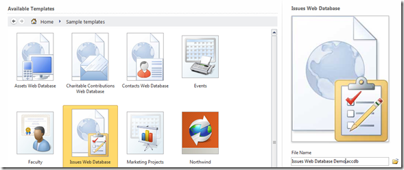
So let’s get started: open Access, go to File / New , click on sample templates, and select the ‘Issues Web Database’ template. You may give the file any name you want – I used ‘Issues Web Database Demo’.
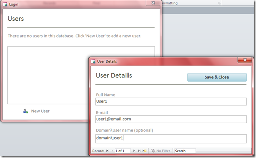
You will be prompted to create a user, which can be mapped to a domain\username, so it automatically logs you on when you start it up. If you’re testing this outside a domain it will still work, but you’ll have to select the user every time you start it up.
You will see the welcome page, and all other pages are organized in tabs. The links available can give you a better idea of how the template works.
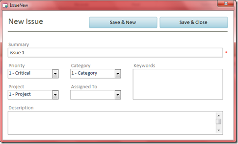
Click on ‘Open Issues’, then on ‘New Issue’ to add some test data.
I recommend adding at least 5 items so our board will have multiple items under a few columns.
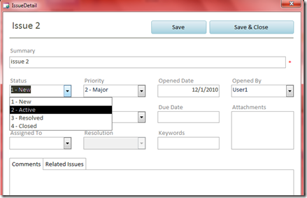
You should also have at least one item for each different status: New, Active, Resolved, Closed. New items are automatically assigned a ‘New’ status. 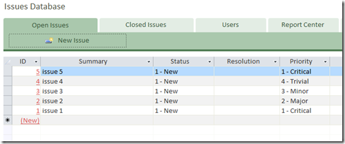
You will need to click on the link (the item ID) to edit it and change the status.
Modifying the application
My biggest issue with this template is that fields like status, category, etc. are mostly hard-coded, instead of being reference tables.
If you decide to use this template as a starting point, I suggest correcting this, which will require you to edit the macros behind the table / form so the logic doesn’t get broken. For instance, whenever an issue changes status, it may trigger specific updates – these macros are similar to database triggers, but are implemented in Sharepoint as workflows.
Since I wanted to use gauges in my report to show progress on a task, I need a place to store that info. This is the only change we’re making to the database at this point.
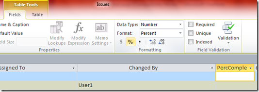
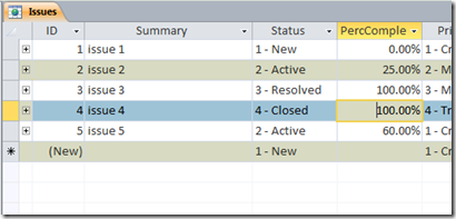
You need to close all forms, edit the ‘Issues’ table, which should be showing up in the navigation panel in the left. Scroll to the end of the table, click to add a number field, and name it PercComplete, formatted as ‘%’.
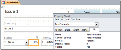
You could now enter the percent complete info directly in the data grid, but if you want to actually use this app you’ll need to correct the data entry form named ‘Issue Detail’.
Just add a text field, map it to the field you added earlier, and you should be able to edit the items to enter meaningful numbers.
When you’re done, New tasks should be 0% complete, Active can have anything up to 100%, and Resolved/Closed should be at 100%. Different values will help test the gauges later on.
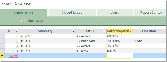
The ‘Open Issues’ grid can also be changed so you can enter the percentages right there. Right-click in a column, select ‘Add Existing Fields’, and drag the PercComplete right after Status.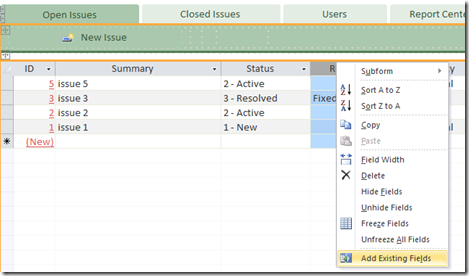
This is how mine looks like:
Publishing the app to Sharepoint Access Services
This is when the magic happens. Your Access app will become a web app – the whole thing will run off a browser, your tables become lists, macros become workflows, and your reports will actually be converted to SQL Server Reporting Services reports.
One great benefit of Access Services is you can save the access web app to your laptop, take it on the road with you, enter changes off-line, and once you’re connected back to your office network, they get synced with Sharepoint automatically. This ‘occasionally connected’ type of app is much harder to implement by hand, but they make it transparent.
In case you’re wondering how it’s done, they basically use negative sequence numbers while off-line, that get converted to proper sequence numbers during syncing.
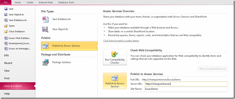
Go to File / ‘Save and Publish’, and select the ‘Publish to Access Services’ button. You will need to fill in your Sharepoint web server address, and pick up a name for the app:
If you made significant changes, or this is the first time you are publishing a web application, it’s recommended to run the compatibility checker, and Access will let you know of any issues that need to be corrected. After being published, the application will open in the browser, but leave the original project open, so we can return to it later.
At this stage, anyone can use it from the browser, without having to open Access anymore.
Creating the Kanban Board
Creating the item report
Go to the report library (or the report server folder) where you want to create the reports under, and start the Report Builder.
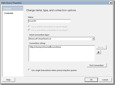
Select a blank report, and create a new dataset that points to the ‘IssuesDemo’ Sharepoint app you created above.
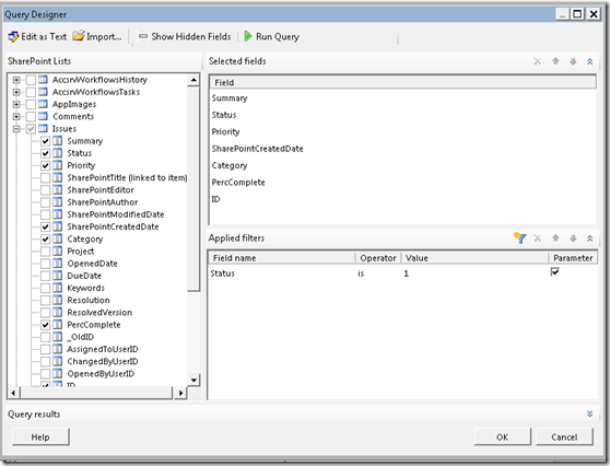
The dataset query will point to the Issues list (equivalent to the Access issues table). Select a few (or all) fields, and add a filter on the Status field, marking it as a parameter. You may default it to ‘1’, meaning ‘New’.
The report layout
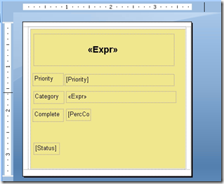
Fist add a new list to the report, then 2 large rectangles, one slightly smaller. Color the inner one similar to a sticky note (or whatever color you like – they could even be conditionally based on categories, for example). The rectangles are just there to let you tweak the spacing between the notes, or add a border if you like.
Inside the innermost one, add a few fields, like the summary text, priority, category, percent complete, and status. You may style it any way you want.
If you run the report now, you can try it with different status codes (1 through 4)
Enhancing the design
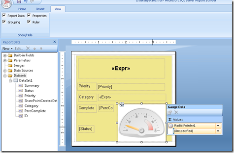
One of the new features from SSRS are the gauges. Let’s add one to indicate progress. Insert one of the Radial gauges in the layout, then drag the PercComplete field into it. The report data panel needs to be visible for you to do this.
Now you will probably need to adjust the gauge to the correct scale – completion goes from 0% to 100%, meaning 0.00 to 1.00.
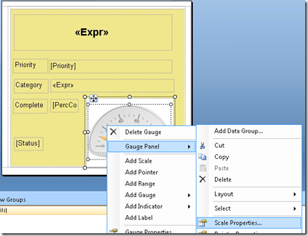
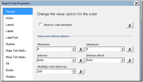
Right-click the gauge, select ‘Gauge Panel’ / ‘Scale Properties’, and make sure the scale goes from 0 to 1, and multiply scale labels by 100.
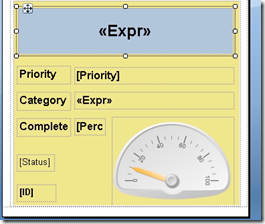
You can preview the report now, and adjust fonts / styles to your liking. When you’re done, save it as ‘IssuesByStatus’, and make sure to note the location.
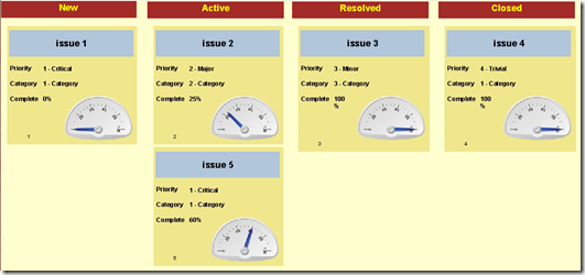
This is what mine looks like now:
Putting the board together
The board is simply a collection of subreports, organized in columns per status (or rows, or other field – your board is your creation).
Start by creating a new blank report – you don’t need any datasets for this one.
Add a text field for each status to the top, formatting it with some background color. The width should be matching the report – you may need to tweak this a bit to make sure they align.
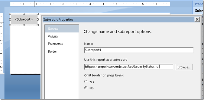
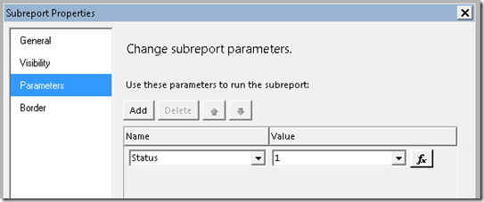
Below each one, add a subreport, select the ‘IssuesByStatus’ as the subreport source, and pass the specific status to each one (1 through 4).
This is what the design should look like (4 subreports, organized in columns):
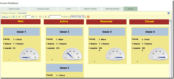
If you execute it, the board should show with all of your issues categorized by status:
If you play with this solution, the first thing you’ll notice is the board will stretch forever – you should limit the completed items by adding some filter (maybe only show tasks completed for the past 10 days). The problem is the issue list does not include a ‘completed date’ field. If this is to be used as a real app, it will need to be corrected. Other improvements could be coloring the label/backgrounds depending on category or priority.
Most boards will have some ‘banding’ or highlight ‘frozen’ tasks somehow. That can be done by using conditional formatting or some indicator (flag, traffic lights, etc).
Adding the board to the web application
While you could just run this report from the folder / library where you saved it, it’s nicer to have it integrated with the Issues Web application. This isn’t hard either.
Go back to the Access application (or if you closed it, navigate to the web app, click on the ‘Options’ drop-down at the top, then select ‘Open in Access’.
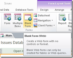
Add a new web form named ‘IssuesBoard’.
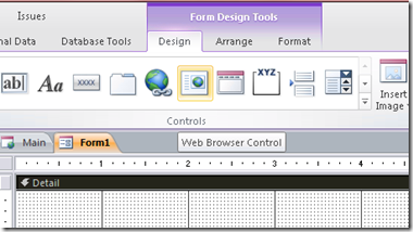
Insert a web browser control to the body.
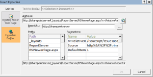
Set the hyperlink properties to the ‘IssuesBoard’ report’s url. Once you paste it, the builder will parse the distinct properties.
It’s a long url, so just copy and paste it. I won’t go into it, but there’s more than one way of asking the server for the report – it depends on being integrated with sharepoint or not, but you could even do things like setting up the default zoom to ‘fit width’.
You can preview the subreport now to make sure it’s ok. You will need to play with the size a bit to get it right.
All that’s left to do is add it to the navigation.
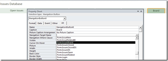
Enter layout mode, click on the ‘Add New’ to the right of the tabs, and add a ‘Board‘ tab. In the navigation target name property, pick up the subform: ‘Form.IssuesBoard’.
Now, even if you save the changes, you’ll notice the web app hasn’t been refreshed.
Go to file / info, and click on ‘Sync All’. This will update the form/report changes.
You may now open the app in the browser, and your brand-new board should show up:
Conclusion
As you could see, the example is far from complete, but it touches on some tools you can use to get your work started. As a challenge, you could change the summary text block to a hyperlink that sends you to the item’s maintenance form within the application.
I hope this will give you ideas, and I apologize if you suddenly have an urge to work your weekend building geek stuff.



How do you use “percent complete?”
What sort of partial progress are folks allowed to claim — versus the more typical done or not done?
FWIW, I try to avoid any sort of measure other than “done” as there is less room for ambiguity.
You’re right – most times it’s hard to measure progress. It’s useful in longer projects, but in truth your percentage may go back as you find out more details about the task. In this case, I really just needed something to show in a gauge.
It’s an amazing article designed for all the online people; they will obtain advantage from it I am sure.
This is a really good tip particularly to those new to the blogosphere.
Brief but very accurate info… Thanks for sharing this one.
A must read article!
What’s up i am kavin, its my first time to commenting anywhere, when i read this paragraph i thought i could also create comment due to this good piece of writing.
This website truly has all of the information I needed about this subject
and didn’t know who to ask.
First of all I want to say terrific blog! I had a quick
question in which I’d like to ask if you do not mind. I was curious to find out how you center yourself and clear your thoughts before writing. I’ve had a difficult
time clearing my thoughts in getting my thoughts out.
I do take pleasure in writing but it just seems like the
first 10 to 15 minutes are lost simply just trying to
figure out how to begin. Any suggestions or tips? Appreciate
it!
Reblogged this on Repository of whatever concerns MS Access and commented:
Something I need to spend some time on and have a closer look.